Design and Approach
| An article |
Starting all over again every time
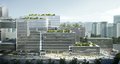
A design strategy needs to be sufficiently powerful to respond to change. If we question the methodology with which schneider+schumacher develop their designs, there is nothing to indicate they always adopt a similar approach. The spectrum of buildings is too broad for that. Not only do projects differ – industrial and office buildings, museums, residential and educational buildings, a church, hotels, bridges – but both scale and context vary too. The office tackles projects on a large urban scale and small-scale projects too, such as furniture design. New buildings, as well as refurbishments and conversions are all part of their repertoire. Sometimes the context offers inspiration: "It whispers something to you" (Till Schneider), at other times construction takes place on a green-field site.

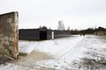
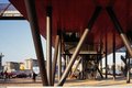
Soviet Special Camp Memorial
© Kirsten Bucher


Soviet Special Camp Memorial
© Kirsten Bucher
A robust foundation – one capable of accommodating change throughout the design process – is contingent on finding the right way of approaching the topic at the outset. So it is crucial to question at the start of a project what really matters: creating an imposing presence, fulfilling a specific function, engendering a particular atmosphere? Michael Schumacher likens design to a brain-twister – one has to reconcile all the various aspects of the brief, yet simultaneously focus on the crux of the matter. At the Soviet Special Camp Memorial the architects wanted to create a restrained ambiance, while simultaneously acknowledging the significance of the site. In this historically charged location anything grand would have been totally inappropriate – especially since this context is characterized not by a display of power, but by its cold calculated pragmatism. The walls surrounding the site, at 2.4 metres, do not seem particularly high, but for a human being without any help they are nevertheless insurmountable. It was therefore decided that the new memorial building should not exceed this height. Instead, it was dug into the ground, and its black concrete facade is so smoothly polished that it reflects the surroundings. The museum does not vanish, but its low entrance and deliberately dense arrangement of beams produce an intense experience that leaves visitors in no doubt as to where they are.
By analysing what is particularly important in a brief, mainly through association, we find a strategic approach.


J. Walter Thompson Building
© Jörg Hempel
Michael Schumacher and Till Schneider describe designing the entrance hall for ‘Trust’, the office's very first commission, as an eye-opening experience. Originally, they planned it with a saw-tooth roof – but it was only very late on in the design phase that the general contractor realised this kind of roof would be too expensive, having initially mistaken its structural components for flower planters. So at short notice, over the weekend, they changed the plans and swapped the saw-tooth roof for a roof with upstand beams, in place of the original downstand beams. Ever since then, the office has been particularly responsive towards the need to absorb such glitches – according to Michael Schumacher it can lead one into terra incognita. And it means too that they are well placed to cope with atypical remits. One such example is the building they designed for J. Walter Thompson, located on the Hanauer Landstrasse in Frankfurt. The site had already been granted building approval – but for a beverage warehouse, which they were then faced with adapting to fulfil the requirements of an advertising agency. The highlight here is a large north-facing glazed space with point-fixed panes, effectively showcasing the building itself. This space also promotes air circulation in summer since the building is not air-conditioned. It still functions like this today, even though now it is somewhat obscured by other structures, so only partially visible from the street.
A powerful basic principle is also helpful in communication – it accurately describes the architects’ interpretation of the task at hand and outlines their priorities, while not committing the architects to any particular narrative or image. It has to reflect the design’s complex and competing demands, but should not ostensibly communicate the full extent of this complexity.
For schneider+schumacher, architecture is not about making images, or symbolic gestures, but about capturing the complexity of the brief using the language of architecture. Here, beauty is not a question of decoration, but rather the art of condensing complexity into a clear form. It is similar to the beauty of mathematics, the Gothic, and the harmonious proportions found in the works of Palladio and Le Corbusier. It is like the beauty that radiates from precise abstract art, be it in a painting by Blinky Palermo, Bridget Riley, or Max Bill. It is the same kind of beauty that appears in what Bernhard Rudofsky compiled and published in the 1960s as "Architecture without Architects", describing the anonymous architecture of nomads and indigenous people, though this can also be found in traditional regional architecture in Europe. These buildings follow certain highly practical and functional patterns. Christopher Alexander elucidated this in his book "A Pattern Language", in which he also showed that such patterns are related to social context. And following this line of reason further, they also relate to the techniques available, and to the materials at hand. Here one is also reminded, and justifiably too, of Thomas Herzog's designs: it is not the notion of a particular shape that informs the design, but a desire to develop the correct form for architectural projects that actively seek to assimilate solar energy as a source of heat into the building concept.
Every half-timbered house evolves from a logical structural principle. It is what keeps architecture permanently anchored. This is another way of understanding architecture. And not merely as a design extravaganza, as happens all too often these days.

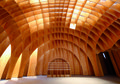
Autobahn Church Siegerland, Germany
© Jörg Hempel
This quote helps to clarify what Michael Schumacher means when he says, "We prefer building sailing boats to motorboats." The elegance of a sailing boat stems from its immense dependence on a set of conditions that effectively cut down the scope for fulfilling the desired function. And it is precisely here that beauty arises, since the emotional is derived from the rational. That is why it makes sense to first explore the full potential of a rational approach. For years now, parametric design at schneider+schumacher has been an integral part of the office, and it has led to efficient structures such as the ribbed timber construction of the motorway chapel, and the three interlocking shells of the Frankfurt Pavilion.

Info Box, Berlin, Germany
© Jörg Hempel
Even when plans have to be amended due to changing circumstances, the underlying concept still determines the outcome. One such early example is a competition schneider+schumacher submitted for the Historisches Museum in Berlin – a glass cube into which they inserted a spiral. Spiral versus cube: a resting directionless body versus directional movement – time and history versus constants and continuity. Their Info Box demonstrates this same quality. Their original idea, of using timber shuttering as a symbol for a building destined to exhibit a construction site, could not be implemented. But the question of colour (shuttering panels were usually dark red at that time) had already been answered. However the idea of elevating the building offered compelling advantages, and simultaneously solved several problems. The alternative – to place the rectangular volume at ground level – would anyway never have been feasible, due to the railway lines running underground, and the quintessential idea of a temporary structure would have been hardly discernable. The Info Box concept underscores a way of thinking about the design process akin to how the ‘Archigram’ group of architects approached their designs in the 1960s.
Along the same lines, the history of the Westhafen Tower project in Frankfurt is also telling. The office tower is one of an ensemble of three buildings in an urban development set around a former harbour basin. Originally the tower was planned with an internal circular service core arrangement around which access was organized in eight segments, with a staircase running around the circumference. But here too, the client decided this would be too expensive, so the core had to be rectangular. The design was changed, but not the essential concept, which is still based on a spiral. Where previously the rotated plan would have realigned every eight rotations, now the fully rotated plan recurs every four floors.
A key feature of the Tower is the diamond pattern in the external glazing, with each element divided into two triangles: it accommodates the appearance of rotation and reminds one of latticework. The square core means that the facade can effectively detach itself from the inner spatial arrangement, so the exterior form no longer mirrors the internal plan. There were several reasons that justified designing a round tower – in spite of its square core – as an urban landmark, for aerodynamic efficiency, and to mark the entrance to the city, since this particular shape has several precedents in Frankfurt. This level of meaning was conveyed without elaborating on the details of the design, and the nickname with which it later became known – “the cider glass” – is ultimately just one of several possible images one could attribute to the building. Although it follows a similar logic to Foster's skyscraper the “Gherkin”, the tower is fundamentally different in appearance. Something else justifies this comparison too: the concept is not dependent on any fixed scale – and so it is not inefficient, as the architects say, to constantly switch scale during the design process.
This kind of design approach also means that, in terms of marketing their work, schneider+schumacher never use architectural language as an end in itself – as is the case with some other successful architects who are forced to imitate themselves again and again. They are not dependent on having to create signature architecture, where the work of a team might compete with the ideas of an individual. Here, both have the potential to produce a successful result.
At the same time, the architects follow a kind of ethos: they never succumb to the temptation to employ a solution a second time round merely for the sake of simplicity if it does not fulfil the same requirements it met first time round. Of course this does not necessarily make life any easier. But it is obviously what keeps them young, and guarantees that they are capable of tackling apparently tricky projects, for example where the site precludes a more conventional solution. This was the case with the Frankfurt Parks Department Office, which combines office space and workshops under one roof. Here they found a particularly ingenious solution for this long and narrow site, directly adjacent to the railway tracks. The five-storey white office block rises above the two-storey plinth with its characteristic wavy façade and the striking termination of the roofline means that all the technical equipment above is hidden from view. With its passive house concept, and the clever use of residual urban space, the project was awarded a prize for sustainable building.

© Till Schneider

© Michael Schumacher
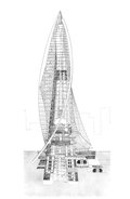
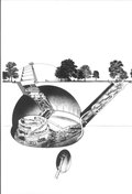
In spite of all this curiosity and the desire to start each project as if it were their very first, there is a single point of departure that, to some extent, exemplifies what the office has achieved to date in terms of architecture: the two skyscraper designs (Till Schneider) and the metamorphosis of an excavator (Michael Schumacher), projects from the 1980s when both were at the start of their careers. Just as Till Schneider’s skyscraper achieves its elegance with a form of construction based on an inherent logic – thereby transcending mere structural concerns – in Michael Schumacher’s Metamorphosis the excavator undergoes a change in which it "bewitches itself" through carrying out the task it was intended for. However ultimately this task becomes something different because the lack of any previously defined objective means that the outcome can only be achieved through the act of excavation. And in doing just this, the excavator produces an end result that would have been impossible to instigate through any deliberate intent. Is not M. C. Escher’s graphic work so popular precisely because it challenges the rational and pushes it to the limit, to a point where its logic becomes intractable, even illogical? And so it is with the poetic: if it remains within the boundaries of what is recognized as being poetic, it remains kitsch. According to Jan Turnovsky, on the other hand, the truly poetic, “is poetic, yet at the same time unpoetic, for example practical". But this also means, according to Michael Schumacher that, “In fact everything is potentially poetic.”
The architecture of schneider+schumacher is lucid and does not need any ideological superstructure, as exemplified by buildings such as J.W. Thompson, which wholly satisfy the old demands of the modernists (and thus Vitruvian principles too). In this context, Till Schneider cites one of his favourite structures: the elliptical penguin ramp designed by Berthold Lubetkin at London Zoo. Two slender intertwined ramps of reinforced concrete, over which the penguins used to waddle. In this design Lubetkin made his mark with architecture that deliberately chose to eschew typical, nature-imitating zoo architecture – a signal that was understood, even though ultimately this architecture proved unsuitable for the penguins. It corresponded to modernist aspirations and it was honest. This touching gesture of seriousness, with its sense of appreciation for both the animals and visitors, transformed something supposedly functional into something emotional. The penguin enclosure is one of the most popular modernist projects in England.